

Choosing the right colors for a new collection is more complex than you might think. Eye-catching is not automatically better, and brands with bright colors don't necessarily come out on top. It's more about understanding the emotional response of customers and the messages a brand sends with a particular color.
As part of ISPO Textrends, we introduce new color palettes every season to inspire and support brands in developing their own concept - not to universally define the season's trend colors. Brands can apply the principle of the ISPO color palettes to their own development, for example, or pick out individual colors to expand their existing selection.

At the beginning of every seasonal collection there is always the Core palette, the most important basis for color selection. It consists of the main colors like traditional black and white to neutral tones and primary colors. Most brands have a core palette for each season that contains colors that have proven to work for them. So the ISPO Textile Trends always start with the core palette.
In addition, the ISPO Color Trends include inspiration palettes, the "satellite palettes". Brands can use these color shades as areas or accents, combine them with each other or with the core palette.
For the spring/summer season, the colors are also going outside, with neutral tones combined with a palette of natural, bright colors. Likewise, surfwear, beachwear and outdoor wear with an urban touch dominate the market. Fitness and well-being, both physical and mental, are in the foreground.
The development of the color palettes for Spring/Summer 2024 also took into account the depth of the colors and the base on which they are used. Here comes the inspiration:
The Core palette has a new spirit based on primary colors, which gives it an organic feel. It is intended to convey a feeling of freedom. The shades can be made more transparent or deeper, depending on the background. Thus, the red is seen here in a softer version, the traditional orange becomes a burnt orange, reminiscent of winter warmth.

The colors of these four palettes function as accents or flat colors. This interplay should encourage brand designers to develop individual designs and differentiate themselves. The key for brands is to be bold. And to recognize their own identity and let this signature flow into the development of customized, timeless designs.
A light and luminous concept for fleeting shades. They can be used discreetly or as a statement, depending on the background, and have a flowing, transparent and airy effect.

A beach-inspired palette that captures the feeling of the sea breeze and the respect we must have for nature. The health of the marine ecosystem is at the forefront. A gentle mood, the attraction of an ancient force. A shade of white is also included. The palette blends perfectly with the natural tones of the Core palette.

Nature will always inspire us with its complexity and versatility, so also when it comes to creating new, interesting colors from natural dyes. This palette is based not only on natural dyes, but also on artificial tones in a more natural version and environmentally friendly synthetic dyes.

This palette consists of colors that constantly change with movement, depending on the emotion of the wearer, and in the sun. Platinum can be used to complement these playful, wild colors.

What is the significance of color in sports and outdoor collections?
Color in collections affects the psyche and buying behavior. It's crucial to understand the emotional response and messages conveyed by each color to make informed design choices.
How does ISPO support brands in color selection?
ISPO introduces color palettes each season as part of ISPO Textrends, providing inspiration for brands. The Core palette, a basis for color selection, is complemented by "satellite palettes" that serve as areas or accents.
What is the Core palette for Spring/Summer 2024 like?
The Core palette for this season has a new spirit based on primary colors, giving it an organic feel. It aims to convey a sense of freedom and can be adjusted in transparency or depth, such as a softer red or a burnt orange reminiscent of winter warmth.
What are the Inspiration Palettes for Spring/Summer 2024?
There are four Inspiration Palettes: Fleeting, offering light and luminous shades; Soul Surf, inspired by the beach and marine ecosystem health; Natural Logic, drawing from natural dyes and environmentally friendly synthetics; and Tantalize, featuring colors that change with movement and emotion.
What themes dominate the Spring/Summer 2024 market?
The market emphasizes neutral tones combined with natural, bright colors. Surfwear, beachwear, and outdoor wear with an urban touch are prominent. The focus is on fitness and well-being, both physical and mental.
How can brands differentiate themselves using these color trends?
Brands can differentiate themselves by being bold in their design choices, recognizing their identity, and incorporating their signature style into the development of customized, timeless designs.
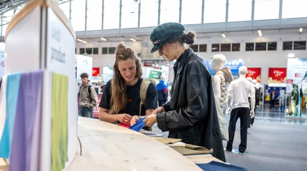
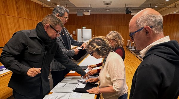 ISPO TextrendsISPO Textrends Jury Meeting for Spring/Summer 2027


- Awards
- Mountain sports
- Bike
- Fitness
- Health
- ISPO Munich
- Running
- Brands
- Sustainability
- Olympia
- OutDoor
- Promotion
- Sports Business
- Textrends
- Triathlon
- Water sports
- Winter sports
- eSports
- SportsTech
- OutDoor by ISPO
- Heroes
- Transformation
- Sport Fashion
- Urban Culture
- Challenges of a CEO
- Trade fairs
- Sports
- Find the Balance
- Product reviews
- Newsletter Exclusive Area
- Magazine
