The use of color isn’t just a case of injecting the bolder newcomers in full, it is about understanding the mood and creating new combinations that will deliver to all sectors.
ISPO.com spoke with Louisa Smith, international textile trend consultant who develops the color palette with ISPO TEXTRENDS up to three years in advance. “It is so important that we develop the palettes in the early stage of the process for future seasons, it allows for a closer connection between the yarn, textile and trim producers to deliver on-trend collections for the designers and brand developers sourcing.
We develop the palettes not just from a color point of view, but also how they will be incorporated by the different fibers and ingredients used to create the collections. Additionally we look to consumer attitudes through the MEGA TRENDS we offer, these also influence the development of the color palette
Textiles Industry and Brands Profit from On-Trend Color Information
Since the conception and continuing success of ISPO TEXTRENDS, it has been evident that companies participating have embraced the colors on offer each season, in providing a fresher appeal to compliment the intelligent ingredients, finishes and fabric structures.
What does it mean to be chic? Learn more about the color trends to come >>>
“It is great to see that color is being worked earlier in the textile chain, and it is no longer just reliant on requests from the final brands. The trend information provided has really been taken on-board over the past seasons, as we see much more color coming through.
In the past textile mills played it safe with basic tones, but now companies participating in ISPO TEXTRENDS are really expressing and enhancing the innovative qualities they develop in a refreshing way through color”, said Smith.
The launch of the Fall/Winter 19/20 color directions will be interpreted by companies participating in the ISPO Textrends process, with the international jury of textile professionals meeting in November to judge, and the products selected will feature at ISPO Textrends in Munich.
Core and Satellite Palettes – a Freeform Approach to Color Applications
Each season ISPO TEXTRENDS highlights a CORE color palette complimented by four satellite or second tier color palettes. “The CORE palette highlights the bestselling colors that sell season after season, we look at black, gray, white and primary tones, but tweak them and inject new colors that compliment to refresh the look.
You have to also consider at ISPO TEXTRENDS we are offering trend information for all sectors of the sports and outdoor industries, and the color palettes are a suggestion of how brands can rework existing palettes that they know sell.”
In the following Louisa Smith explains the key color directions from ISPO TEXTRENDS that can be incorporated and worked in full or just used as accents. The inspiration for the season comes from organic and natural ideas to more techno applications, sometimes with a twist.
1. Core Is King
We always include a key color palette that connects with basic bestselling tones. The majority of companies have a key base palette, one that they are familiar with and know that works. To refresh and refrain from being stale, we teak this staple palette each season.
As well we're changing the saturation of tones and introducing new accents. For Fall/Winter 19/20 we have taken a natural inspiration, and you can see that the primary tones are a little bit more woody in appearance and have great depth to them.
2. The Importance of Satellite Color Palettes
These are really important, in that they are varied but appeal to a wide range of final applications whether it be base layer or backpacks. What is important is that these colors can be teamed with tones from the CORE palette or used as solids or as trims.
At ISPO Textrends, we don’t dictate, we try to inspire textile suppliers and brands in developing their collections each season by sharing information that we collect. Brands know their bestsellers on the color front, what appeals to their customer base, but we hope through the information we provide we can take it up a notch each season and also suggest tones that will further enhance typical colors used in the industry.
3. Satellite Color Palette # 1 Escapist
This is a really interesting color palette in that inspired by the dream of escapism and depending it is applied it can take a truly whimsical direction in matte substrates.
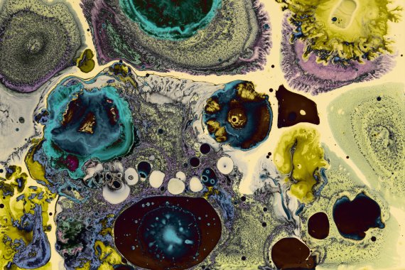
And as well through to a more intense look in gloss and coated applications. Colors vary depending on the fibers and finishes you use, they take on a chameleon look, in that they react differently in a visual way.
4. Satellite Color Palette # 2 Retro Robotic
With artificial intelligence becoming more and more developed we decided to use it as an influence, but not what is happening at present, more of a retrospective to the visionaries of the 1970s who correctly predicted the technology that surrounds us today.

This palette is very clean. We would suggest it in compact and perfect surfaces from semi dull to bright lusters to compliment and contrast.
5. Satellite Color Palette #3 The Big Chill
This is a very much a natural inspiration, and despite the wintry and frosty element of our inspiration visual it is actually a sharp palette that can be interpreted in a very warming way.

We expect to see these colors come through in performance wool applications through to more interesting raised surface effects. It is very much an oxymoron, as visually it is cool but does have a really warm and snug appeal.
6. Satellite Color Palette #4 Acute
A electrifying and energizing inspiration appealed to us in an artificial way. This is techno with a twist, we will see this palette form a sense of mimicry as natural fibers and bio sustainable yarns embrace a futuristic approach.
There is a feel of enlightenment and this will be used in full by bright tri-lobal yarns and high gloss membranes contrasting with perfect base layer knits that will offer a skeletal protection through body mapping and zoning.
7. The Final Call for Color
With the application open for the next ISPO Textrends, Louisa Smith has one last piece of advice on the color front. “Don’t be scared of using color, it is so important, whether it is a rich, organic tone through to an electrifying bright.
To embrace a new direction it doesn’t have to be in full, steering away from your company’s heritage, it can be approached in a subtle way, through trims and even top stitching. We are getting excited about the applications for ISPO Textrends Fall/Winter 19/20 and expect to see some great innovations on the textile and trim front come through.”
Video: How to Develop Sustainable Sports Fashion

